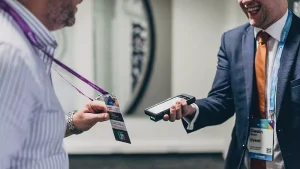
Data-driven booth traffic analysis using heatmaps and sensors

You’ve spent thousands on a trade show booth. The banners are crisp. The swag is… well, it’s swag. But when the show ends, you’re left with a nagging question: Did anyone actually stop by? Or worse—did they just walk past, glance, and keep going?
Here’s the thing. Counting bodies isn’t enough. You need to know where they lingered, why they paused, and what made them leave. That’s where data-driven booth traffic analysis comes in—using heatmaps and sensors to turn foot traffic into actionable insights. Honestly, it’s like giving your booth X-ray vision.
Why old-school booth metrics are failing you
Hand counters? Clipboard surveys? Those are relics, like fax machines at a tech conference. They tell you how many people visited, sure. But they don’t tell you how they moved, what they touched, or where they got bored.
Think of it this way: a restaurant owner wouldn’t just count customers—they’d watch which tables fill first, which menu items get ignored, and where the bottlenecks form. Booth traffic analysis is no different. You need granular, spatial data. Heatmaps and sensors deliver exactly that.
Heatmaps: the visual story of foot traffic
Heatmaps are, well, exactly what they sound like. They use color gradients—reds for high activity, blues for low—to show where people congregate. But here’s the kicker: they’re not just for websites anymore. Physical heatmaps, generated by overhead cameras or infrared sensors, map real-world movement in your booth.
What a heatmap actually reveals
Let’s say your booth has a demo station on the left and a product display on the right. A heatmap might show a red blob around the demo station—meaning visitors cluster there—but a cold blue spot near the display. That’s a red flag. Literally.
You can then ask: Is the display too cluttered? Is the lighting off? Or is the demo just that magnetic? Heatmaps don’t just show where people go—they hint at why.
Types of heatmaps for trade shows
- Static heatmaps: Aggregate data over hours—great for spotting overall patterns.
- Dynamic heatmaps: Show movement over time—like a timelapse of human flow.
- Attention heatmaps: Track where people look (using eye-tracking or camera focus).
- Dwell heatmaps: Highlight spots where people stop for more than a few seconds.
Each type answers a different question. Static tells you where. Dynamic tells you how. Dwell tells you what matters.
Sensors: the silent data collectors
If heatmaps are the visual story, sensors are the raw numbers behind it. We’re talking about:
- LiDAR sensors: Laser-based, super accurate—track movement even in crowds.
- Bluetooth/WiFi sniffers: Detect smartphones (with consent) to measure dwell time and return visits.
- Pressure mats: Simple but effective—count steps and weight distribution.
- Infrared beams: Count entries/exits at specific zones.
Here’s the deal: sensors don’t lie. They don’t get tired. They don’t guess. A pressure mat under your demo table can tell you exactly how many people stepped up to try the product—and for how long.
Combining sensors for richer data
One sensor alone is like a single instrument in an orchestra. Combine them, and you get a symphony. For example:
| Sensor Type | What It Measures | Best Paired With |
|---|---|---|
| LiDAR | Movement paths | Heatmap software |
| Bluetooth sniffers | Dwell time per device | Pressure mats |
| Infrared beams | Entry/exit counts | Video cameras |
| Pressure mats | Footfall density | LiDAR for flow |
That combo—LiDAR plus heatmap software—gives you a real-time, color-coded map of where people walk, stop, and avoid. It’s almost… spooky how precise it is.
How to set up a booth traffic analysis system
You don’t need a PhD in data science. You just need a plan. Here’s a step-by-step that’s worked for exhibitors I’ve talked to:
- Define your zones. Break your booth into 3-5 areas: entrance, demo, display, seating, exit.
- Choose your sensors. Start with one or two—maybe a LiDAR unit and a pressure mat. Don’t overcomplicate.
- Install discretely. Hide sensors in ceiling tiles, under carpet, or behind signage. You want data, not a sci-fi vibe.
- Sync with software. Most sensors connect to cloud platforms (like Density or WaitTime) that generate heatmaps automatically.
- Test before the show. Run a 30-minute mock session. Check for dead zones or interference.
Pro tip: don’t forget to anonymize data. Privacy matters—especially with Bluetooth sniffers. Always get opt-in consent if you’re tracking devices.
Real-world example: from chaos to clarity
I once worked with a SaaS company that had a huge booth—like, 20×20 feet. They thought foot traffic was great. But after installing overhead cameras and running a heatmap analysis, they discovered something wild: 70% of visitors never made it past the first 6 feet. They hit a bottleneck at the entrance, got overwhelmed, and left.
So they redesigned the layout. Moved the demo station closer to the entrance. Added a clear path. Result? Dwell time jumped by 40%. That’s the power of data—it shows you what your gut misses.
Common pitfalls (and how to avoid them)
Look, no system is perfect. Here are a few things that trip people up:
- Over-relying on one metric. High foot traffic doesn’t mean high engagement. Pair counts with dwell time.
- Ignoring context. A heatmap might show a red spot near the coffee station—but that doesn’t mean your product is popular. It means people like free caffeine.
- Bad placement. If your sensor is blocked by a pillar, you’ll get garbage data. Test sightlines.
- Forgetting to iterate. One show’s data is a snapshot. Compare across events to spot trends.
Honestly, the biggest mistake? Thinking data replaces human intuition. It doesn’t. It informs it. Use heatmaps and sensors to ask better questions, not to silence your gut.
The future of booth analytics
We’re already seeing AI-powered systems that predict traffic patterns before a show even starts. Imagine: you upload your booth floor plan, and the software simulates crowd flow based on past data. That’s not sci-fi—it’s happening now.
Also on the horizon? Emotion detection via facial coding (with consent, of course). Cameras that read micro-expressions—surprise, boredom, delight—and overlay that onto heatmaps. That’s next-level. But for now, start with the basics: heatmaps and sensors. They’re affordable, proven, and surprisingly easy to implement.
Bringing it all together
Data-driven booth traffic analysis isn’t about replacing the human element of trade shows. It’s about amplifying it. When you know exactly where people pause, you can design better experiences. When you see which demos attract crowds, you can double down on what works.
So next time you’re planning a booth, skip the guesswork. Install a sensor. Watch the heatmap. Let the data whisper—or shout—what your booth is really doing. Because in the end, a booth isn’t just a space. It’s a conversation. And now, you finally know who’s talking.